When some of the oldest established brands in cosmetics, from Dior to L'Oreal, have been around for decades, it can be challenging for small makeup brands to break into the industry. However, since it was founded in 2014, Colourpop Cosmetics has taken the market by storm with its high quality products that are made cruelty-free for a fraction of the cost of comparable luxury brands. And while the company itself has grown and expanded since its introduction to the industry, so has the branding and packaging used to deliver the company's products and messages to its audience.
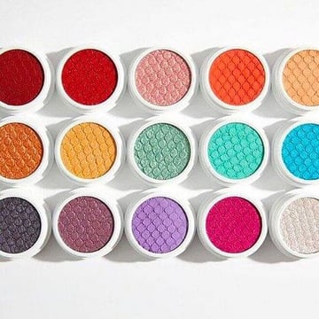 ColourPop started out extremely small, entering the beauty industry with just a single product line to its name: the now ubiquitous Super Shock Shadow. It was one of the first eyeshadows of its kind, delivered in a soft, almost squishy semi-wet formula that many brands have tried to emulate since. When these shadows first launched, ColourPop was exclusively sold online, meaning that there was no in-store displays or point of sale advertising to tell the world who the brand was. Instead, ColourPop actually went with branding designs for its website and packaging that were rather understated. The shadows were packaged in plain white, screw top pots, and the original website design was clean and white as well. It's my speculation that this branding was chosen for a variety of reasons.
For one thing, simple packaging was probably a way for ColourPop to keep costs down, but more than that, plain packaging lets the product speak for itself. One of the selling points of the eyeshadow was the rich color payoff it promised, so what better way to sell color than to showcase it instead of hiding it behind flashy packaging?
However, as time went on, ColourPop gained massive popularity online through influencers and general social buzz, and it began to expand its product offerings. For the first few launches, like a highlighter, lipstick, and lip liner, the packaging stayed the same: plain white. However, it wasn't long before something in ColourPop's brand identity changed, and so did the packaging.
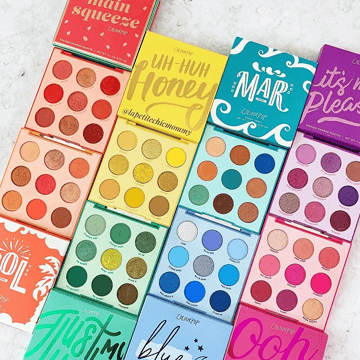 As ColourPop gained more popularity in the beauty space, its product launches came faster and faster until it became a good-natured joke among beauty enthusiasts: ColourPop launches something new almost every day. Like its name implies, ColourPop Cosmetics puts a huge emphasis on color in its products, and as the brand began branching into products like eyeshadow palettes, neon eyeliners and mascaras, and bold lipsticks and glosses, the white packaging started to disappear. Though the older products are still sold in the white containers, these newer products began shipping out in multicolored sleeves and tubes.
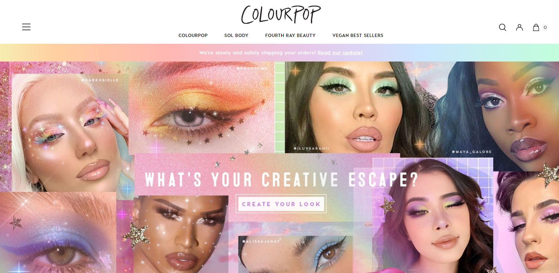
From what I was able to research, ColourPop had never made a statement about its brighter packaging designs, I have a few theories about the change and why it was successful. While ColourPop was already growing in popularity, there has been a recent trend that helped bring the brand even more to the forefront: monochrome palettes. These sets contain 9 or more eyeshadows in different shades of a single color, and the packaging reflects the color inside. The brand's biggest fans bought multiple palettes, and when stacked together and posted on Instagram, these palettes form a rainbow of sorts. Nowadays, ColourPop's website contains more rainbow-hued accents against its trademark white background, which I think may be a nod to its dedication to offering shadows in practically any color -- a claim it couldn't have made six years ago.
But perhaps with growing popularity comes another reason to change up the branding. By now, most makeup enthusiasts know that ColourPop generally makes high quality products. In that case, there's no longer the same necessity to put the product itself on the forefront. Instead, ColourPop can focus on innovating with new formulas and packaging instead, in order to entice customers to keep buying. If every palette was pure white on the outside, the untrained eye might assume the palettes are all the same, which is far from the truth. By incorporating more color into its branding and packaging, ColourPop is now able to differentiate its different launches, collaborations, and product lines from each other so that consumers know they're getting something totally new.
While ColourPop is constantly launching new cosmetic products and colors, its branding had changed to reflect what the customer can expect from the brand. From the all-white look to something much more rainbow-inspired, ColourPop's branding style has not only grown and developed with the brand but also helped it stand out among its competition on the web.