Personally, when I think of "branding", I typically think about consistency. I think about the use of a constant color palette, fonts, and the maintenance of an overall aesthetic. In my opinion, branding is one of the most important things for a business, organization, or brand. It is first thing that attracts me to a brand. Typically, if the branding is inconsistent (or just poor in execution), my attention moves to other, prettier places. I think Patagonia, an outdoor clothing company, practices consistent branding incredibly well, just as an example.
However, there are rare instances of branding running counter to this idea of "consistency" And, my favorite band at the moment, The 1975, does just that. For each of their four albums, the group from Manchester has reinvented their identity.The 1975's first, self-titled album attempted to tackle what lead singer Matty Healy describes as "the apocalyptic sense of being a teenager." The album art introduced their now iconic "box" — a neon rectangle which, at first, was black and white. This monochromatic color palette was the uniting factor in the "world" of the first record. The music videos were in black and white, as well as the stylized poster/photos that accompanied each song on the album. Even all four band members dressed in black and white, just to tie it all together.
_by_The_1975.png?width=300&name=The_1975_(album)_by_The_1975.png)

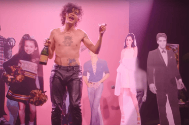
On their second album, the indulgent - but in a good a way - I Like it When You Sleep, for You Are So Beautiful Yet So Unaware of It, The 1975 referenced the music of Prince, Michael Jackson, and 9o's R&B. So, their new aesthetic followed a similar glow, quite literally. The song posters for each track featured a neon pink sign, with the "box" adopting that color as well. The pink hue found its way into music videos such as "Love Me," which sees Healy dancing shirtless and wearing makeup in front of cardboard cutouts of Harry Styles, William Burroughs, the Queen, and more. If the title of ILIWS suggests excess, the aesthetic of the world created by the band for this album really drives it home.
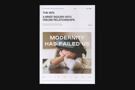
The band's next album, 2018's A Brief Inquiry Into Online Relationships, asked big questions and was met with big reinvention. The band dropped the "box" as their album artwork. And while it was still a vital component to their live shows, this decision got rid of one of the only consistencies for the band's branding album to album. Now, Healy and company embraced David Byrne style suits, typographic texture, and more politically charged content. And through this, the digitally curious world of ABIIOR was created.
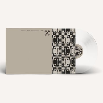
The Manchester four-piece's most recent album, Notes on a Conditional Form, came out at the end of May 2020. Healy describes the record as an inward record, asking, "Can the center hold" in these unprecedented times? Notes media is consistently neon yellow or a beige/gray, keeping consistent with the album's art and the "People" music video. Notes feels raw and dynamic sonically, and its visuals (such as Healy's appearance) support this idea. Healy now has a strange mohawk-mullet, and he is wearing vintage tees and dresses. He is a long way from the designer leather jackets and black skinny jeans of the debut album.
Perhaps all of this is long-winded way of saying that the only thing The 1975 have kept constant about their brand IS reinvention. While The 1975's branding is very different from album to album, it has been incredibly curated and consistent within the world of each album. And although this is obviously easier for an indie rock band than a B2B organization, there are still lessons to be learned here. If my fan boy ramblings are an indication of anything, it is how engaging such reinvention can be. I believe this to be especially true in the digital age. So whether you are consistent or active, be intentional with your branding. It is noticed; and, it can surely make your audience invested in your product.